Projects
Oweski Front-End Capstone
Oweski is a way to easily track a “back and forth” debt and/or credit amongst friends, and has turned out to be a very rewarding and satisfying project for me, both personally and as a student/developer. I utilized HTML, CSS, JavaScript, AngularJS, MaterializeCss, and FireBase. What I took away from this project was that I could actually do the things I set out to accomplish. (Visit Oweski.me)
TallyHome Back-End Capstone
TallyHome is a diary of milestones for your home. It can be used to catalog home improvements such as: the purchase of new appliances, major upgrades (roof, home addition/renovation, HVAC, plumbing, electric, etc…) as well as a place to keep track of the receipts, warranty and insurance information, appliance life-cycle expectancy and images. I got this idea from wanting a way to keep up with the changes I've made to my own home. TallyHome is a simple way to track all the information regarding home updates in one place. TallyHome was created using many of the tools I've learned in my time at NSS: HTML, CSS, JavaScript, MongoDB, Mongoose, AngularJS, Bootstrap, Express, and Node.JS. (Visit TallyHomeApp.com)
AccessAble UX Capstone
AccessAble is aimed at helping individuals with disabilities gain easier access to concert tickets. Using the practices of modern day UX, I named and framed the problem, discovered my users and created personas to focus my problem statement, journey mapped their situations, mocked up, and iterated, iterated, iterated my suggestion/solution. This was a great learning experience and AccessAble is something that I plan to develop further, as I feel like a need could be filled and a population could be helped. (Read more on Wordpress)
WYSIWYG Exercise
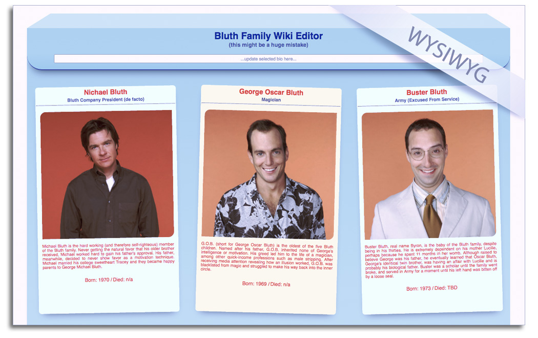
For this exercise the front end portion of the class, we were tasked with creating a series of cards that react to user input. I really enjoyed this project as I got to stretch my legs a bit on some of the CSS and animations. I spent a good deal of time trying to figure out how to make the "3 dimensional" folder flap at the top. I did so with a second "invisible div" above the main content div. This allowed me to play around with the border bottom and create the desired effect. This project I totally went "down the rabbit hole" and just kept digging and digging for the result I wanted. (Check it out on Codepen)
